Sunday 23 October 2016

Studio Session

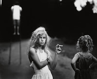
On Wednesday we had our studio session with Jamie where we got into pairs and discussed our chosen 20 images relating to our quotes. This was so so helpful because it meant that we discussed loads of topics surrounding the quote I'd not contemplated. These are some of the most interesting ones that came up:

1. In relation to the Instagram makeup artist image I brought in, and the negative comments on some graphic makeup art, is it responsible for people to let their children have Instagram knowing that they might see this content, and if thats the case, do they then have the right to leave negative feedback blaming the graphic content? You don't really just come across things like this on Instagram, you have to search for it.

2. Does the context of the art make it more less offensive? If you can explain why you've done it, does that make it ok? 

3. Does where the art is placed (exhibit, online etc.) make it any more or less serious/ valid/ worthy or unworthy of judgement?

4. Does not being able to understand art put people off and make it seem scary/ offensive? 

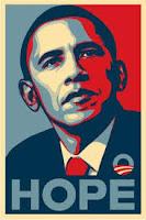
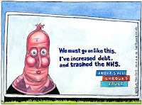
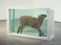
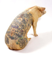
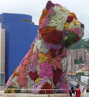
All of these seem to be good starting points for more exploration into the subject, as a beginning task I took my images and organised them into categories of which kind of offence they could cause:

Political/ religious:


Gory/ ugly/ crude:


Hard to understand/ abstract:


I noticed some running themes in the categories such as the themes of sexualisation and animal rights in the second one. Next I intend to look into whether or not its a bit patronising to theorise whether or not not being able to understand art makes it confusing and subsequently irritating to some people.

Friday 14 October 2016

Finding Research Sources

Today we had a seminar on how we can find research sources for any writing we have to do using the sources that are available to us. We were given a list and had to try and find three resources for each method of research relating to our chosen quote. My quote is the one on society by David Shrigley, "In the studio the artist has no responsibility. But when the artist displays his work the situation changes."

From completing this exercise, I have determined that research is hard and takes a lot of time! But that I really like google scholar as it helps you find much more short, concise articles about exactly what you're looking for. In future I need to remember to designate time to doing only research and doing it well. 


Wednesday 12 October 2016

History Of The Image Lecture

Today we had a lecture on a 20,000 year, non linear history of the image starting by looking at the Lascaux cave paintings in France. There isn't much that is known factually about these caves or the paintings in them, but they are thought to be around 17,300 years old and consist mainly of images of large animals that are known to have lived in that area at that time. Although some people believe that they are simply records of what happened during the course of peoples days, there is also another theory that these images were some kind of attempt to communicate with a higher power through the use of ritualistic symbols and signs. This would make some sense since when you look at the paintings although some are very linear and simple, others are done using a series of small dots and seem to portray nothing in particular. Its theorised that maybe they were attempts through mystic ritual to better their hunting attempts in future. 

What I found interesting was that these images can be almost compared to images made by Rothko or Pollock, in the way that their process seems to be chaotic and have no meaning to it (in the case of the cave paintings this is because we have no historical reference to that time) but in actual fact they all have a system and an ideology behind them. For example in Hans Namuths film 'Jackson Pollock at work in his studio' from 1950, we can see that Pollock works out what he wants to put where on the canvas before starting, where he rolls the canvas out on the floor so that he can closer to it. He even walks along and over the canvas whilst he paints almost so that he can further partake in the image being made. What links these two very different images being made is that the could both be described as being made in a state of surrealist Automatism, which is the act of letting go of the conscious thought making process and letting the unconscious mind have free reign with what is being created. Both of these processes look otherworldly and subsequently throw the viewer into an emotive mindset while observing them as this unconscious thought process makes these images all the more powerful. 

Both of these images are successful in their own right, but Pollock was a massive commercial success, even being employed by the CIA to create some works to express to the rest of the world the freedom of America through the free art style. But is art that is more organically made in this kind way automatically 'better art'? For instance, when Stalin came to power in the late 1920's, he banned any type of avaunt guard modern art simply because he thought it was more elitist, pretentious and that people couldn't understand it so what was the point in it? He preferred only social realist styles which portrayed Russia as something very different to what it was, however, by banning this 'pretentious' art and insisting on realism, you could argue that he wasn't trying to oppress anyone, but simply to make art easier to understand for everyone. However through Americas campaign to make surrealism seem like the beacon of freedom and 'high-brow' society, some people now always associate realist styles with being out of touch and possibly more 'low-brow' styles. 

I would contemplate whether, just because something has a bit more of a thought out process behind it and is done in a very linear way, if it makes the experience of seeing it first hand any less magical. Having had a very linear approach in my own work (now trying to train myself out of it), I find it a little insulting to think that the only 'good art' can be free, unconscious expressions on paper. Just because you mark it out with pencil before hand, does it make the intention any less free?

I've gone off on a bit of a tangent on the subject but mainly in addition to discussing this idea, we also talked about the power of symbols and images in popular culture and how overall, image making can be a very powerful political, societal and cultural tool, so as creators we need to learn how to use it diplomatically and creatively to inform our practice. 

Friday 7 October 2016

Investigating My Own Quote

As a continuation of the Triangulation and Analysis blog post, we were asked to come away from the lesson and chose another quote and analyse this one in the way we were shown. I am choosing to look at the quote from the technology section from Phil Taylor which reads "The alchemy of analogue is more unpredictable, and therefore more alluring". 

The quote communicates to me straight away that its the journey involved in creating a piece of analogue art work that is so appealing to people, you never know how its going to turn out. I believe it fits into the theme of technology as in the developing world, particularly in fields such as illustration, technology is fast becoming something that is at all of our fingertips. If we wanted, we could now use software to create what only years ago we would have to collage or draw by hand. With new technologies related to the arts being created every month, we have the choice whether or not to jump on the band wagon. Where we can more or less collectively agree that advances in medical technology have benefitted everyone, could we see the same change for the arts? The key terms here are alchemy, unpredictable and alluring, it might also be worth looking up technology. 

Alchemy means a seemingly magical process of transformation, creation, or combination. Which I think perfectly describes using only analogue processes to make art, it is a special process in which the creator is involved directly with every step. As there can never really be any major pre-planning of analogue art as there can be with digital the end result is usually at least a little different to what you'd expect which makes the process more of a journey.  Unpredictable actually just can be defined as not predictable, but if we were to relate this specifically to art I would say also that unpredictability in work can sometimes mean it seems more organic and authentic. It also suggests to me uniqueness which is a valuable skill in art, no one wants to have the same work as someone else. However, these qualities seem to either set you apart from the rest and make work more sellable, or do the opposite and mean people struggle to identify with the work. 

Alluring means powerfully and mysteriously attractive or fascinating or seductive. I agree that analogue methods of creating can be really interesting and much more engaging than maybe the routine of computerised work, but firstly, I would question if there isn't the same attraction about digital work. Especially if you still aren't fully aware of how these processes work then the experimentation involved with experimenting on different bits of software I'm sure can be just as rewarding and exciting. Secondly, I can see how if you wanted to make really experimental and varied work then analogue media would be ideal, but what if you wanted to create some more intricate, uniform work? Its also worth noting that this quote is from 2009, when maybe people were less enthusiastic and accepting of new technologies. However, these things are more commonplace in the arts now and digital art is a valid and accepted art form in its own right.

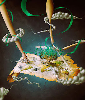
For instance this image below is by Igor Scekic a digital artist from Zagreb. For me this is no less thought out than any analogue process and I'm sure it was still a fascinating process to watch it develop and unfold. Its not just about the final method of production of an image either as although this was created on photoshop, I'm sure there must have been some detailed and thoughtful sketches and designs that came before this. If you can argue that something like photo shop isn't a skill and is impersonal, surely you can say the same for screen printing?


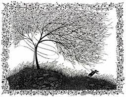
Also if you look at Rob Ryans paper cut works, although he cuts most of them by hand, he has also said that he uses some photoshop methods to add in shadows and to edit them slightly. This being said, that doesn't make his work any less beautiful or the methods behind it less exhaustive. Sometimes non-analogue methods can be used to fine time analogue work.


In conclusion although I do agree that there is something particularly cathartic about producing the majority of your work by hand, there is some instances where non analogue methods are necessary such as during mass production, or simply if the process will look better for it. I believe it does nothing to take away from the value of analogue work when digital methods are being used and they are on offer to us so why not use them?

Investigating Quotes

Today we had our first proper COP briefing with Pete where we were told about our first proper brief and what to expect. Our first piece of writing for COP will be a 1000 word piece of writing on Triangulation and Referencing. To make a start on this we were all given a sheet with quote on under the subject headings of social, political, history, culture, technology and aesthetics. From this we were then put into small groups and had to pick one quote and analyse it, I'm guessing in the way that we would be expected to analyse quotes relating to our ongoing work. 

My group picked a quote from the society section 
"In his studio the artist has no social responsibility. But when the artist displays his work the situation changes." 
David Shrigley, (2015) Untitled, synthetic polymer paint on paper, Department International Prints and Drawings, National Gallery of Victoria, Melbourne. 153.0 x 111.0 cm

Then we had to answer these questions in regards to the quote-

What is communicated by the quote?
- The artist has the responsibility whether or not to be controversial. 
- It also references that the audience plays a part in the artists work as it effects how the work will be received.

How does it fit within the theme? (society)
- It talks about how society will react to certain pieces of art work, possibly could be talking about political work or some things of a more sensitive subject nature.
- Implies that the artwork is your own when its not been shared with someone and is still on the drawing board, but as soon as it is put out into society then it becomes a social issue.

What are the key terms within the quote that can be investigated?
- Social responsibility, displays, society.

Define those key terms and link them to examples
- Social Responsibility: according to google definitions social responsibility is an ethical framework and suggests that an entity, be it an organisation or an individual, has an obligation to act for the benefit of society at large. It is every ones duty to perform so as to maintain a balance between the economy and the ecosystems. 
- Society: The aggregate of people living together in a more or less ordered community. But interestingly can also mean an organisation or club formed for a particular purpose or activity. 
- Display: Put something in a prominent place in order that it may readily be seen. 

In conclusion I think this quote is very interesting as its sort of saying that as soon as you chose to display your work, it takes a bit of the private ownership away from it and means it belongs to both the public and you to share your opinions on. But firstly I'd raise the question of whats meant by display and how does this effect who has a right to an opinion on this piece? Because you could argue that if this has been viewed in an exhibition in a gallery that has been purposely set up to display this work, and therefore ticket holders have some prior knowledge of the artist, then can they offended? Surely they knew what to expect when booking the tickets and they could take it with a pinch of salt in that case? Or does the fact they have purchased tickets mean that they then have more of a right to their opinion? Also would it be a different case if we were to talk about displaying work on Instagram for example, because anyone can stumble across any content there, which means that if you display your personal opinions on your account and then someone chooses to look at and comment on that uninvited, is that fair? 
Also it is interesting to see what is meant by society, as from the definition it could very well mean just the whole of society and whoever may come across it. But it could also refer to a small society of art critics, who have the prior knowledge to make a fair and unbiased judgement about pieces. 

Wednesday 5 October 2016

Lecture 2: Visual Literacy- The Language of Design

Today was our first proper lecture from Fred starting with the topic of visual communication and visual literacy. I'd never really contemplated either of these things before but oddly have been using these things all my life. Visual communication is the process of sending and receiving messages through the use of type and images which is something that serves as a cornerstone of illustration. These messages are sent and received using a shared understanding of symbols, signs, gestures and objects and can be affected by many things such as the audience receiving the messages, the context we see the messages, the media and the method in which the messages are distributed. 

We then went on to learn that visual communication is driven by visual literacy which is our ability to construct certain meanings from image and type. As the images we are trying to understand can be from the past, the present, different cultures and countries we need to have at minimum a base understanding of these things which directly informs our visual literacy. As creators we also need to be able to effectively communicate a message to an audience which can be easily understood and in turn appreciated. 

To help give us more context about visual literacy, we then learnt about the principles of the subject. Principle one references our ability to interpret the things were seeing, negotiate them and then make meaning from them, which it turns out is something we all do every day without realising. For instance when were in a foreign country and we see signs with a man and a woman on them, we know that we will soon be entering gendered toilets. Interestingly though, these signs are never hyper-realistic, often only showing a blue curved line for a man and a pink line for a woman. Usually though we still understand this and its fascinating to question whether we do this through a sophisticated level of learnt global communication or whether its something that through social conditioning we've just learnt to come to expect. 

Principle two is based on the idea that images can be read just like words in a book, for example, medical instructions or the ikea manual. You are able to see outlines of how many pills to take, and at which times of the day, and who is not suitable to take the pills e.g. children, and from this you know the doctor recommended way to take your medication via a common set of symbols. This can be essential again in foreign countries or simply to quickly understand things is perhaps your literacy skills are lower than your visual skills.

Principle three references presentational symbols which exist in a certain context, which by adding or taking away the context then directly affects our ability to read and understand them. The conventions of visual communication are combined with cultural and societal elements which give them context. So for instance when you see just a + symbol on its own, to many different people it could mean 100 different things such as church, religion, add symbol, medical, but when combined with the context of =, we start to see that + = together makes reference to the mathematic signs add and equals. Put simply, the same signs can mean different things depending on the context, environment and the associative meanings of these things. 

Principle 4 says that in order for any language to exist, all that is necessary is an agreement amongst a group of people the one thing stands for another. This involves something that I'd never come across before called visual semantics. This focuses on the relationship between a symbol and what it stands for, for example the 'I heart NY' slogans. Over time its become accepted that the symbol of a heart can stand for the word love (in the right context) and that the abbreviation NY stands for New York. This understanding changes a jumble off random letters into a very marketable slogan, through its history and its culture. 

Principle 5 means that being visually literate requires awareness of the relationship between visual syntax (another new word) which basically means the structure and organisation of certain elements in an image to affect the way we read it e.g. framing, scale, colour, texture, saturation, scale. You can see through examples of images of the cooked breakfast that Fred showed us where one is beautifully presented and the other in zoomed in at an angle and is darker in colour and more textural, how even if an image is made up of the same elements it can appear different thanks to the minute details which connote certain ideas or feelings. This is something I now know I can apply to my work to make it more visually appealing or to garner a reaction from people. 

Under the same umbrella was visual semantics which is how the image fits within its context and how we read it based on where it is, cultural, social and historical elements. This I guess refers a lot to our audience and that we must make sure when producing work that the visual semantics are fitting to our intended audience, e.g. not referencing old 70's shows in projects that are intended for children to understand. 

We briefly touched on the theme of semiotics which is something that really confuses me but is essentially the study of signs and sign processes, indication, designation, likeness, analogy and metaphor. It fits in with the study of linguistics and I think this is important for us to know about and understand how certain signs we may use in our work can be ready by people and how we can use them in the most effective way. 

The most interesting part of the lecture for me was the part near the end when we touched on symbols, signs and signifiers which was one of the few things I'd heard of briefly before. As an example of this (so I don't forget) is if we were talking about Dominoes pizza, the symbol or their logo would be a blue and red domino, the sign so their identity is pizza and side dishes to deliver or order, and the signifier or the brand would be delicious pizza, cheese and good service. This is important for us to be able to identify what certain companies values and impacts on society are so that we reference their signs in our work, we know what people think they can expect from it. 

In a similar vein we talked about how this would apply to New York. If you see the statue of liberty, a yellow cab and a big apple together then you can pretty safely assume that New York is being referenced, however none of these things really specifically apply to that city alone and nothing else. The statue of liberty is a visual synecdoche, which is when a part is used to represent the whole. However this is only an effective technique if the image is universally recognised. The yellow cab is used as a visual metonym, or a symbolic image used to make reference to something with a more literal meaning. And the apple is a visual metaphor which is used to transfer the meaning from one image to another. Although the two things may have no close relation, a metaphor conveys an impression about something relatively unfamiliar comparing and associating it with something more familiar to the viewer.
This could help us when dealing with different kinds of client bases to help certain people feel like what might be a more unsavoury or difficult subject is somehow more easily accessible.